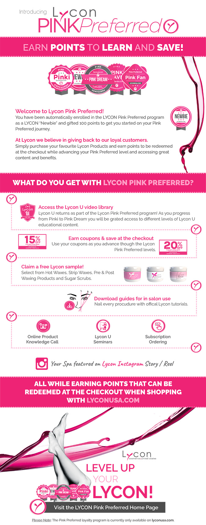
Case Study – LYCON USA Pink Preferred Program
Background / Brief
Jump To
Once we mapped out what we wanted to achieve a number of tasks were identified, these included;
- Relevant Web pages
- Level structure
- Editing of raw video material with graphic overlays
- Clean up existing video content with standardised titles and thumbnails
- Terms & Conditions
- Promotional Copy, Graphics & Icons
- A badge graphic identifying each level
- MailChimp Campaign
- User Roles for content access and restriction
- Video Library uploaded to and embedded from Vimeo
- Change all existing registered user roles to Pink Preferred Newbie
Once configured, the YITH Points and Rewards plugin automatically changes a user’s level when a number of points is reached. This worked well for the issuing of points, but another solution was required, a need to grant access to content for different levels. I use Ultimate Member for user role management, so set up a corresponding user role for each of the Pink Preferred Levels.
Pink Preferred Levels to achieve.
Responsive layout of personalised welcome and Mobile Menu.

Software
Graphics created with Illustrator, free sample product images with Dimension. Promotional video created with After Effects. Standardised LYCON U video content cut with Premiere Pro.
Points functionality – YITH Points and Rewards plugin.
Website built with WordPress – lyconusa.com/pink-preferred-home
Production timeline: 8 Weeks
For the dollar value to increase as customers progress through to Pink Dream, Points Rules for each level had to be set up in the YITH Points and Rewards plugin.
Pink Preferred Level badge and link to corresponding page for logged-in User in site header area.

Pink Preferred Level badges.
Email sent to users notifying them of a change in their points. Using WooCommerce Add To: Cc: Bcc: Email Recipients Mini-Plugin I was able to configure this to be CC’d to site admin to help manage user role switching via Ultimate Member.
LYCON Pink Preferred Graphics and Website layouts
Graphics created with Illustrator, Dimension and Photoshop.
LYCON Pink Preferred Level Badges

Lycon USA Promotional Video
Created with Illustrator, After Effects
Duration: 00:12
12 second loop for website and social media
Self shot vertical video supplied by client, edited with graphic overlays to enhance viewer experience and help convey message.
Pre Post Waxing Products
Choosing the right wax
Strip Waxing Jars & Heaters

MailChimp Campaign Copy and Design


